")
Have you ever looked at a big table full of numbers and felt totally confused. That’s why we use something called data visualization. It basically means turning boring numbers into pictures like graphs and charts so they are easier to understand. If you are learning Python or just curious about how to show data in a better way there is a really cool tool called Matplotlib. Professionals like data analysts use this library in their day-to-day lives to perform several tasks.
It is like a drawing tool in Python that helps you make all kinds of charts. You can make simple line graphs bar charts or even more fancy stuff once you get the hang of it. The best thing is you don not need to be a genius or have a lot of coding experience. If you know a little bit of Python then also you are good to go. In this blog i will show you how to use Matplotlib step by step in the easiest way possible so you can start making your own graphs without any stress.

Getting Started with Matplotlib in Python
Before we start making cool graphs, we need to make sure Matplotlib is ready to use in our Python setup. It is not built-in so we have to install it first.
How to Install Matplotlib in Python
If you are using something like Jupyter Notebook, VS Code, or even just the command line installing Matplotlib is super easy. Just open your terminal or command prompt and type this.
pip install matplotlib
Once it is installed then you need to import it in your Python file or notebook. Most people use this short way.
import matplotlib.pyplot as pltPost importing matplotlib try this code snippet a little to understand the terms.
import matplotlib.pyplot as plt

x = [1, 2, 3, 4]
y = [10, 20, 25, 30]

plt.plot(x, y)
plt.show()
Types of Plot You Can Make Using Matplotlib in Python
Now that you have installed Matplotlib and made your first tiny graph. Let’s look at the different types of plots you can create. Each type helps tell a different kind of story with your data. You do not need to remember everything right away as you just have to read through and get an idea of what is possible. We will go through the most common ones step by step:
Line Plot
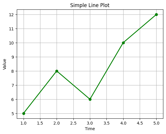
This is the simplest and most common type of plot. If you want to show how something changes over time or across steps then in that case line plots are perfect.
A line plot is used to show trends or changes over time. It connects data points with straight line which is making it easy to see how values go up or down. It is perfect for showing progress, growth, or any continuous data.
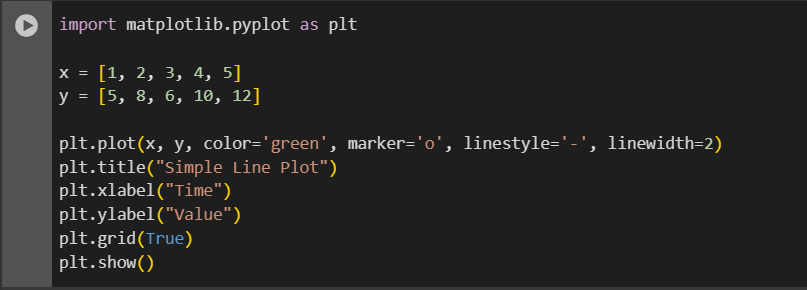
import matplotlib.pyplot as plt

x = [1, 2, 3, 4, 5]
y = [5, 8, 6, 10, 12]

plt.plot(x, y, color='green', marker='o', linestyle='-', linewidth=2)
plt.title("Simple Line Plot")
plt.xlabel("Time")
plt.ylabel("Value")
plt.grid(True)
plt.show()
Bar Chart
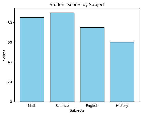
A bar chart is used to compare values of different categories. Each bar is having height that represents a value. It is great for showing counts, totals, or frequencies across groups.
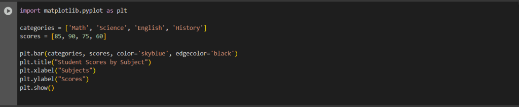
import matplotlib.pyplot as plt

categories = ['Math', 'Science', 'English', 'History']
scores = [85, 90, 75, 60]

plt.bar(categories, scores, color='skyblue', edgecolor='black')
plt.title("Student Scores by Subject")
plt.xlabel("Subjects")
plt.ylabel("Scores")
plt.show()
Pie Chart
A pie chart shows how a whole is divided into parts. Each slice represents a percentage of the total. It is best for showing proportions or percentages.
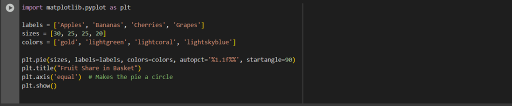
import matplotlib.pyplot as plt

labels = ['Apples', 'Bananas', 'Cherries', 'Grapes']
sizes = [30, 25, 25, 20]
colors = ['gold', 'lightgreen', 'lightcoral', 'lightskyblue']

plt.pie(sizes, labels=labels, colors=colors, autopct='%1.1f%%', startangle=90)
plt.title("Fruit Share in Basket")
plt.axis('equal')  # Makes the pie a circle
plt.show()
Histogram
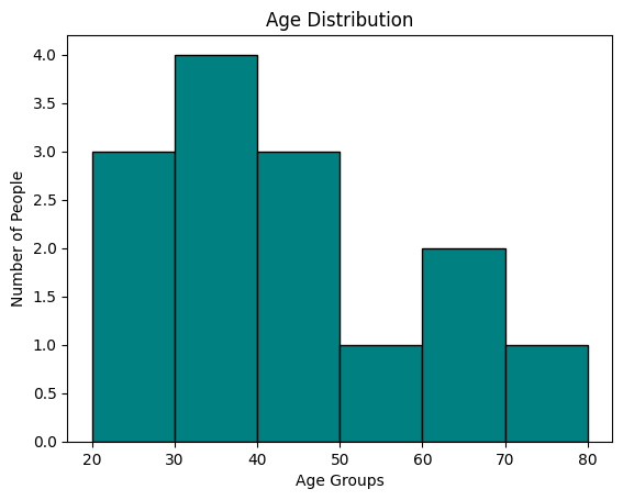
A histogram groups values into ranges called bins and shows how many values fall into each range. It is commonly used to see the spread or distribution of data.
import matplotlib.pyplot as plt

ages = [22, 25, 27, 30, 35, 35, 36, 40, 41, 45, 50, 60, 65, 70]
bins = [20, 30, 40, 50, 60, 70, 80]

plt.hist(ages, bins=bins, color='teal', edgecolor='black')
plt.title("Age Distribution")
plt.xlabel("Age Groups")
plt.ylabel("Number of People")
plt.show()
Scatter Plot
A scatter plot shows individual data points based on two variables. It helps you see patterns or relationships between the two variables like whether one increases as the other increases.
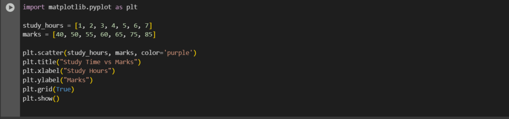
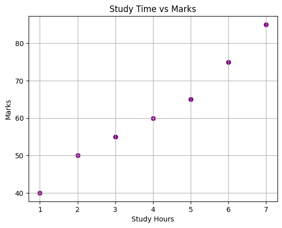
import matplotlib.pyplot as plt

study_hours = [1, 2, 3, 4, 5, 6, 7]
marks = [40, 50, 55, 60, 65, 75, 85]

plt.scatter(study_hours, marks, color='purple')
plt.title("Study Time vs Marks")
plt.xlabel("Study Hours")
plt.ylabel("Marks")
plt.grid(True)
plt.show()
Customizing Plots in Matplotlib
Making a graph is not just about putting lines and bars on the screen. It is about making it clear and attractive so people can understand it easily. Matplotlib gives you many ways to customize your charts that will help you can change colors, styles, add titles, labels, legends, and more according to the logic.
Adding Titles and Labels
A title tells what the graph is about. Labels help people understand what each axis shows.
import matplotlib.pyplot as plt

x = [1, 2, 3, 4]
y = [10, 20, 25, 30]

plt.plot(x, y)
plt.title("My First Line Plot")
plt.xlabel("X Axis - Time")
plt.ylabel("Y Axis - Sales")
plt.show()
Changing Styles and Colors
plt.plot(x, y, color='red', linestyle='--', marker='s')
plt.title("Styled Line Chart")
plt.xlabel("X Axis")
plt.ylabel("Y Axis")
plt.grid(True)
plt.show()
Adding a Legend
x = [1, 2, 3, 4]
y1 = [10, 20, 25, 30]
y2 = [5, 15, 20, 22]

plt.plot(x, y1, label="Product A", color='blue')
plt.plot(x, y2, label="Product B", color='green')
plt.title("Sales Comparison")
plt.xlabel("Quarters")
plt.ylabel("Sales")
plt.legend()
plt.show()
Comparison of Different Matplotlib Charts
| Plot Type | Best Use Case | Data Type | Can Compare Categories | Shows Trend Over Time | Easy to Read |
| Line Plot | Showing trends or changes over time | Continuous | No | Yes | Yes |
| Bar Chart | Comparing values across categories | Categorical | Yes | No | Yes |
| Pie Chart | Showing parts of a whole as percentages | Categorical | Yes | No | Medium |
| Histogram | Checking the distribution of data | Continuous | No | No | Yes |
| Scatter Plot | Finding relationships between two numeric values | Continuous | No | Sometimes | Medium |
Frequently Asked Questions
What is Matplotlib used for?
Matplotlib is a Python library used to create all types of graphs and charts like line plots, bar graphs, pie charts and more. It helps you visualize your data easily.
Can I customize the look of my graph?
Yes you can change the title, colors, labels, line styles, and even the size of your graph using simple functions in Matplotlib.
What’s the difference between plt.plot() and plt.bar()?
plt.plot() is used to draw line charts, while plt.bar() is used to draw bar charts. They are used for different kinds of data.
How do I show multiple graphs together?
You can use plt.subplot() to divide your graph window and show more than one graph at a time.
Do I need internet to use Matplotlib?
No actually once you install the library, you can use it offline in your local Python environment.
Is Matplotlib good for beginners?
Yes as it is one of the easiest libraries to learn if you are starting out with data visualization in Python.
Conclusion
Matplotlib is like a drawing tool for your data. It helps you turn boring numbers into clear and colorful graphs that anyone can understand. Whether you are working on school projects or real-world business reports Matplotlib makes it easy to show what is going on in your data. With just a few lines of code you can make your data come alive. Once you get the hang of it you will realize how powerful and flexible it really is.


