
When you are just starting with machine learning then linear regression itself feels like the go to solution for predicting trends or patterns. But what happens when your data does not follow a straight line. That is where polynomial regression comes in. It is an extension of linear regression that helps you model more complex, curved relationships between variables. In this blog, we will break down what polynomial regression is and why it is useful and how you can implement it in Python step by step. Whether you are a student, a beginner, or just someone trying to make sense of non-linear data then this guide will help you get started with polynomial regression in the simplest way possible.
Introduction to Polynomial Regression
Sometimes when you try to draw a straight line through your data using linear regression, it just does not fit well. The points are all over the place and the line does not really follow the shape of the data. That is when polynomial regression comes in handy.
Think of it like this instead of drawing a straight line as you let the line bend and curve to follow the shape of your data. It is still using the same basic idea as linear regression but with a twist that adds powers of your input variable to help draw that curve.

So if your data is not straight and looks more like a curve then this method lets your model learn that curve better. It is like teaching your line some flexibility.
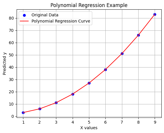
import numpy as np
import matplotlib.pyplot as plt
from sklearn.linear_model import LinearRegression
from sklearn.preprocessing import PolynomialFeatures

# Step 1: Some sample data that looks like a curve
X = np.array([1, 2, 3, 4, 5, 6, 7, 8, 9]).reshape(-1, 1)
y = np.array([3, 6, 11, 18, 27, 38, 51, 66, 83])  # Kind of like a curve (not a straight line)

# Step 2: Make the input data more powerful (add x^2)
poly_features = PolynomialFeatures(degree=2)  # You can try degree=3 or more too
X_poly = poly_features.fit_transform(X)

# Step 3: Train a linear regression model on the new data
model = LinearRegression()
model.fit(X_poly, y)

# Step 4: Predict values using the trained model
y_pred = model.predict(X_poly)

# Step 5: Plot the original points and the predicted curve
plt.scatter(X, y, color='blue', label='Original Data')  # actual points
plt.plot(X, y_pred, color='red', label='Polynomial Regression Curve')  # the curve
plt.title("Polynomial Regression Example")
plt.xlabel("X values")
plt.ylabel("Predicted y")
plt.legend()
plt.grid(True)
plt.show()
Why Use Polynomial Regression in Machine Learning?
Linear regression works well when the relationship between your input and output is a straight line. For example, if studying more hours directly increases your marks in a steady way, linear regression is a good fit. But real-life data isn’t always that simple.

Sometimes the data goes up and down or forms a curve. In those cases, a straight line does not match the pattern well, and the predictions turn out wrong. This is where polynomial regression becomes useful. It allows the model to fit a curve instead of just a straight line by including higher powers of the input variable like x² or x³. So if your data looks curved and a straight line does not do a good job, polynomial regression can help the model capture the shape better and make more accurate predictions.
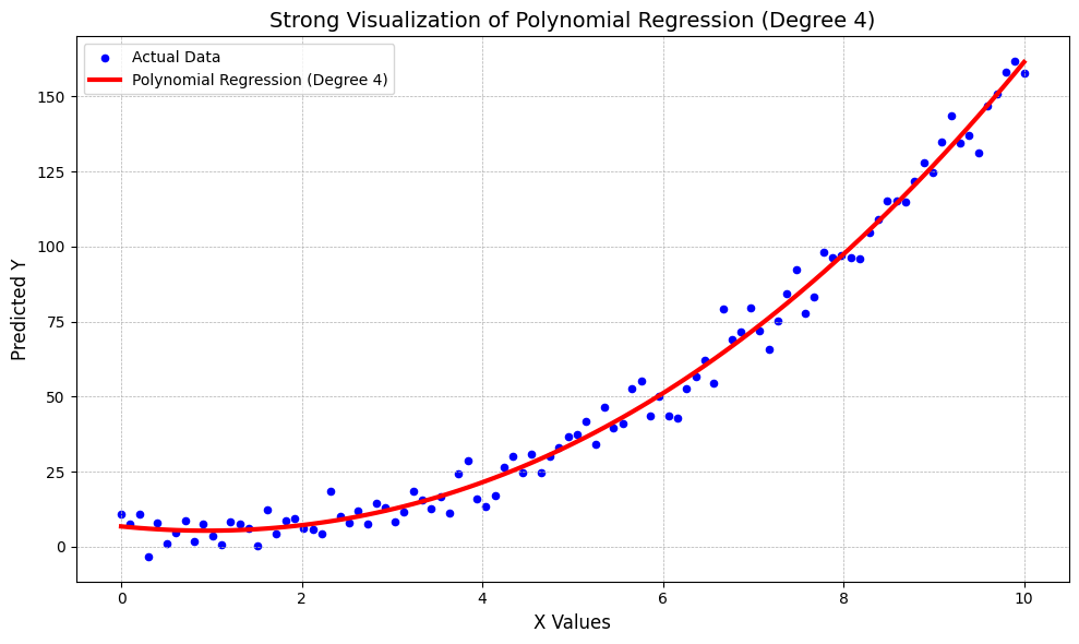
import numpy as np
import matplotlib.pyplot as plt
from sklearn.linear_model import LinearRegression
from sklearn.preprocessing import PolynomialFeatures

# Generate more data for a smoother curve
X = np.linspace(0, 10, 100).reshape(-1, 1)
# Create a complex non-linear pattern
y = 2 * X.flatten()**2 - 5 * X.flatten() + 10 + np.random.randn(100) * 5

# Use a higher-degree polynomial (degree=4)
poly = PolynomialFeatures(degree=4)
X_poly = poly.fit_transform(X)

# Train the model
model = LinearRegression()
model.fit(X_poly, y)

# Predict values
y_pred = model.predict(X_poly)

# Plotting
plt.figure(figsize=(10, 6))
plt.scatter(X, y, color='blue', s=20, label='Actual Data')  # original data points
plt.plot(X, y_pred, color='red', linewidth=3, label='Polynomial Regression (Degree 4)')  # fitted curve

# Decorate the plot
plt.title('Strong Visualization of Polynomial Regression (Degree 4)', fontsize=14)
plt.xlabel('X Values', fontsize=12)
plt.ylabel('Predicted Y', fontsize=12)
plt.legend()
plt.grid(True, linestyle='--', linewidth=0.5)
plt.tight_layout()
plt.show()
Mathematical Intuition Behind Polynomial Regression
Polynomial regression might sound complicated, but it’s quite easy to understand when you break it down.
In linear regression, the goal is to fit a straight line to the data. The equation for that line looks like this: y=b0+b1xy = b_0 + b_1xy=b0+b1x
In this equation, y is the predicted output, x is the input or independent variable, b₀ is the intercept which shows where the line crosses the y-axis, and b₁ is the slope which controls how steep the line is.

This works well when your data follows a straight-line pattern. But in many real-life situations, data isn’t that simple. It may curve or bend, and a straight line just can’t capture that pattern. That’s where polynomial regression comes in.
Polynomial regression adds more terms to the equation by raising the input variable x to higher powers. For example, a second-degree polynomial looks like this: y=b0+b1x+b2x2y = b_0 + b_1x + b_2x^2y=b0+b1x+b2x2
Now we’re fitting a curved line instead of a straight one. If the data is even more complex, we can use higher degrees: y=b0+b1x+b2x2+b3x3+⋯+bnxny = b_0 + b_1x + b_2x^2 + b_3x^3 + \dots + b_nx^ny=b0+b1x+b2x2+b3x3+⋯+bnxn
Each power of x adds more flexibility to the curve, allowing it to follow more detailed patterns in the data. The higher the degree, the more twists and turns the curve can make.
However, using a very high degree can lead to a problem called overfitting. This means the model starts fitting even the random noise in the data instead of just learning the real trend. That’s why it’s important to find the right degree that balances accuracy and simplicity.
Steps to Implement Polynomial Regression in Python
Import the required libraries
import numpy as np
import matplotlib.pyplot as plt
from sklearn.linear_model import LinearRegression
from sklearn.preprocessing import PolynomialFeatures
Prepare your dataset
# Input (independent variable)
X = np.array([1, 2, 3, 4, 5, 6, 7, 8, 9]).reshape(-1, 1)

# Output (dependent variable)
y = np.array([3, 6, 11, 18, 27, 38, 51, 66, 83])
Transform the input data to include polynomial features
poly = PolynomialFeatures(degree=2)  # You can try degree=3 or higher too
X_poly = poly.fit_transform(X)
Fit the model
model = LinearRegression()
model.fit(X_poly, y)
Make predictions
y_pred = model.predict(X_poly)
Visualize the result
plt.scatter(X, y, color='blue', label='Original Data')
plt.plot(X, y_pred, color='red', linewidth=2, label='Polynomial Fit')
plt.title('Polynomial Regression Curve')
plt.xlabel('X')
plt.ylabel('y')
plt.legend()
plt.grid(True)
plt.show()
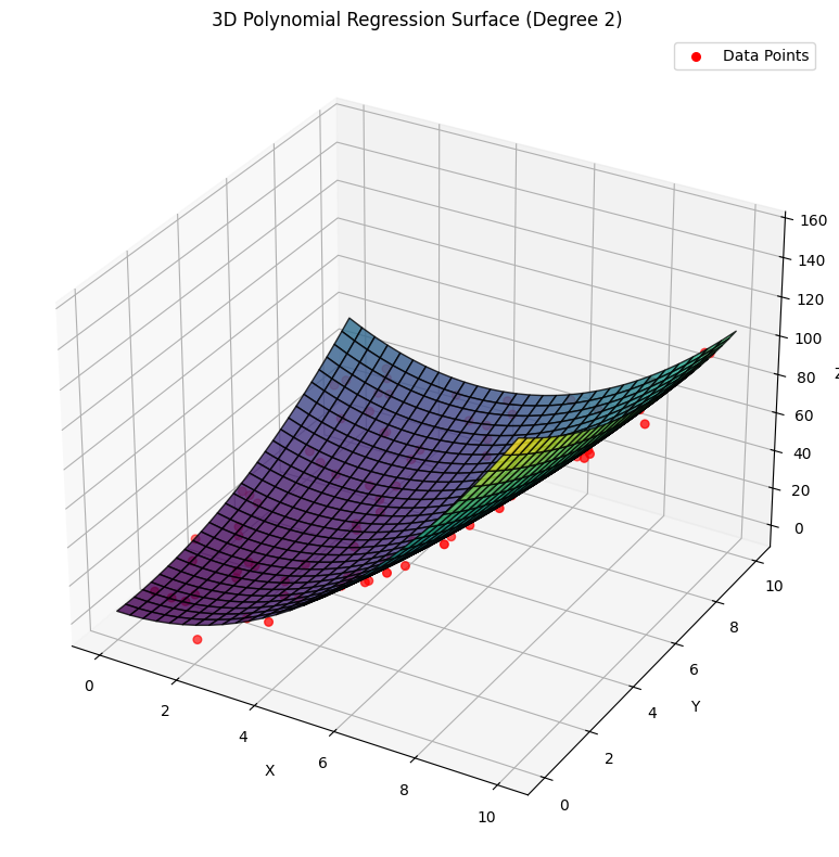
Practical Code Example (Python Implementation)
import numpy as np
import matplotlib.pyplot as plt
from sklearn.preprocessing import PolynomialFeatures
from sklearn.linear_model import LinearRegression
from mpl_toolkits.mplot3d import Axes3D

np.random.seed(42)
x = np.random.rand(100, 1) * 10
y = np.random.rand(100, 1) * 10
z = 1.5 * x**2 + 0.5 * y**2 - x*y + 2 + np.random.randn(100, 1) * 5

X = np.hstack((x, y))

poly = PolynomialFeatures(degree=2)
X_poly = poly.fit_transform(X)

model = LinearRegression()
model.fit(X_poly, z)

x_grid, y_grid = np.meshgrid(np.linspace(0, 10, 30), np.linspace(0, 10, 30))
grid_points = np.c_[x_grid.ravel(), y_grid.ravel()]
grid_poly = poly.transform(grid_points)
z_pred = model.predict(grid_poly).reshape(x_grid.shape)

fig = plt.figure(figsize=(12, 8))
ax = fig.add_subplot(111, projection='3d')
ax.plot_surface(x_grid, y_grid, z_pred, cmap='viridis', alpha=0.8, edgecolor='k')
ax.scatter(x, y, z, color='red', s=30, label='Data Points')
ax.set_xlabel('X')
ax.set_ylabel('Y')
ax.set_zlabel('Z')
ax.set_title('3D Polynomial Regression Surface (Degree 2)')
ax.legend()
plt.tight_layout()
plt.show()
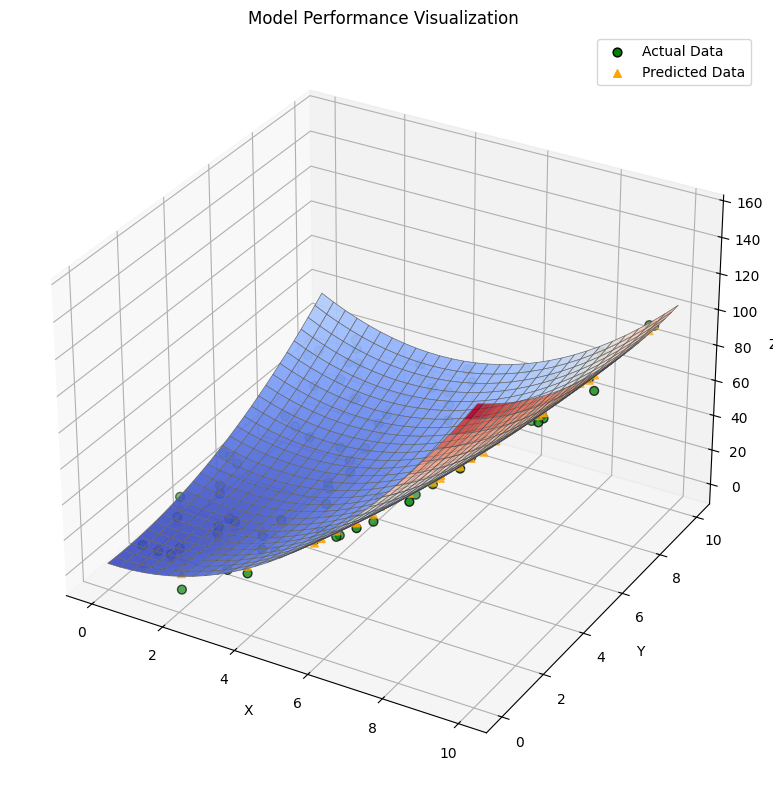
Evaluating the Model Performance
To know if our polynomial regression model is doing a good job, we need to check how close its predictions are to the actual data. One common way is to calculate something called the R-squared value that tells us what percentage of the data variation is explained by our model. The closer this value is to 1 the better the model fits. We can also plot the predicted surface alongside the real data points in 3D to see if the model’s curve nicely follows the data. If the points sit close to the surface that means the model is performing well.

import numpy as np
import matplotlib.pyplot as plt
from sklearn.preprocessing import PolynomialFeatures
from sklearn.linear_model import LinearRegression
from sklearn.metrics import r2_score

np.random.seed(42)
x = np.random.rand(100, 1) * 10
y = np.random.rand(100, 1) * 10
z = 1.5 * x**2 + 0.5 * y**2 - x*y + 2 + np.random.randn(100, 1) * 5

X = np.hstack((x, y))

poly = PolynomialFeatures(degree=2)
X_poly = poly.fit_transform(X)

model = LinearRegression()
model.fit(X_poly, z)

z_pred = model.predict(X_poly)

r2 = r2_score(z, z_pred)
print(f"R-squared value: {r2:.3f}")

x_grid, y_grid = np.meshgrid(np.linspace(0, 10, 30), np.linspace(0, 10, 30))
grid_points = np.c_[x_grid.ravel(), y_grid.ravel()]
grid_poly = poly.transform(grid_points)
z_surface = model.predict(grid_poly).reshape(x_grid.shape)

fig = plt.figure(figsize=(12, 8))
ax = fig.add_subplot(111, projection='3d')
ax.plot_surface(x_grid, y_grid, z_surface, cmap='viridis', alpha=0.7, edgecolor='k')
ax.scatter(x, y, z, color='red', s=30, label='Actual Data')
ax.scatter(x, y, z_pred, color='blue', s=20, label='Predicted Data')
ax.set_xlabel('X')
ax.set_ylabel('Y')
ax.set_zlabel('Z')
ax.set_title('Model Performance Visualization')
ax.legend()
plt.tight_layout()
plt.show()
Advantages and Disadvantages of Polynomial Regression
- Polynomial regression can bend and curve to fit data that isn’t just a straight line, so it handles complex patterns better.
- It is easy to use because it is like linear regression but with extra terms which is making it simple to learn and apply.
- By changing the polynomial degree you can make the model simpler or more detailed depending on what the data shows.
- It is great for data where the relationship between variables is not straight but curved or twisted, which happens in many real situations.
- Polynomial regression can still work well even if you have only a small amount of data, as long as the degree is chosen carefully.
- If the degree is too high then the model might fit the training data perfectly but fail on new data meaning it learns noise instead of the real pattern.
Applications of Polynomial Regression
- It is used in economics to predict things like how prices change when demand goes up or down in a non-linear way.
- Engineers use it to model the relationship between stress and strain on materials that do not behave in a straight line.
- In biology, it helps study how populations grow when the growth rate changes over time instead of staying constant.
- It’s helpful in weather forecasting to capture complex patterns like temperature changes over days or months.
- In finance, polynomial regression can model stock prices or interest rates that do not follow simple straight trends.
- It is used in robotics and computer graphics to smooth curves and paths for better movement or drawing.
Conclusion
Polynomial regression is a useful tool when data does not follow a straight line and shows more complex patterns. It helps us create models that fit curved relationships better than simple linear methods. While it has some drawbacks like overfitting and complexity with many variables, it is still easy to use and works well for many real-world problems. By understanding when and how to use polynomial regression you can improve your predictions and get more accurate results from your data.

Frequently Asked Questions (FAQs)
When should I use polynomial regression instead of linear regression?
You should use polynomial regression when the relationship between your input and output is curved or non-linear and a straight line (linear regression) does not fit the data well.
Can polynomial regression work with multiple features?
Yes polynomial regression can work with more than one input by mixing them together in different ways but if you have too many inputs or use very high degrees the model can become really complicated and hard to handle


